Interior Colour Consultation and Decorating UK
Choosing the right interior colour consultation and decorating UK services is the first step toward a successful home transformation, as wall colour is one of the most significant decisions you will face during a home renovation. The perfect shade has the power to completely redefine a room’s character, elevate your mood, and even manipulate the perception of space—making small rooms feel airy or large halls feel intimately cosy. As a company with years of hands-on experience in the British renovation industry, Dartnall Decor has prepared this comprehensive guide to help you navigate the world of professional decorating.
1. Psychology of Wall Colours in Home Design: How Paint Affects the Human Body
Choosing a colour palette is far more than a simple aesthetic preference; it is the strategic design of stimuli that will interact with your nervous system for years to come. In the world of interior colour consultation and decorating in the UK, we treat paint not just as a finish, but as a functional element of well-being.
The Science Behind the Shade
Colours are, in essence, electromagnetic waves of varying lengths. When these waves reach the retina of the eye, they trigger electrical signals sent directly to the hypothalamus in the brain. This is the “command centre” for our endocrine system, emotions, and physiological processes. Therefore, the psychology of wall colours in home design is rooted in biology, not just fashion trends.
Biological Reactions to Colour
Understanding the physiology of colour allows us to consciously model a home environment that supports your lifestyle while avoiding common design pitfalls:
- Impact on Heart Rate and Blood Pressure: Clinical studies have demonstrated that intense colours from the warm spectrum—such as deep reds or vibrant oranges—can physically increase heart rate and elevate blood pressure. These shades stimulate the sympathetic nervous system, creating an “alert” state. While perfect for a high-energy dining room or a creative hub, they may be overstimulating in areas meant for deep relaxation.
- Circadian Rhythms and Melatonin: Your wall colour interacts constantly with both natural and artificial lighting. Cool-toned blues and crisp whites can inhibit the secretion of melatonin, the sleep hormone. While this is beneficial in a bathroom during your morning routine to help you wake up, the same cool tones in a bedroom might lead to restlessness or difficulty falling asleep.
- Cortisol and Stress Reduction: Conversely, soft greens and muted blues are known to stimulate the parasympathetic nervous system. This biological trigger inhibits the production of cortisol (the stress hormone) and encourages the body to enter a state of regeneration. This is why our interior colour consultation often recommends “biophilic” tones for lounges and master suites to create a sanctuary from the frantic pace of modern life.
By understanding these neurological triggers, Dartnall Decor ensures that your home isn’t just beautiful to look at, but restorative to live in. Whether we are conducting a professional decorating project in a period property or a modern apartment, we align our colour recommendations with the primary biological function of each room.
2. Colour Characteristics
When engaging in an interior colour consultation and decorating UK project, understanding the specific properties of each hue is essential. Colour is not merely an aesthetic choice; it is a functional tool that defines how we interact with our living spaces. Below, we explore the primary palette through the lens of the psychology of wall colours in home design.
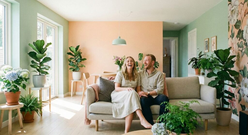
Green: Harmony, Balance, and Biophilia
Green holds a unique position in interior psychology. As the colour most closely associated with nature, the human eye perceives it as the most neutral and least fatiguing shade. Incorporating greenery into a room’s design introduces an element of harmony and tranquility. Depending on its saturation and colour temperature, green can shift the atmosphere significantly: pale, pastel mints offer a sense of freshness and vitality, while deep forest or bottle greens build a profound feeling of security and stability. At Dartnall Decor, we frequently recommend these tones for spaces dedicated to regeneration—such as bedrooms or snugs—where reducing the user’s stress levels is the primary objective.
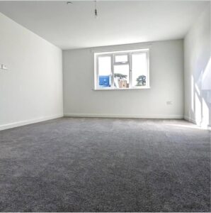
Grey: Modernity and the Risk of Melancholy
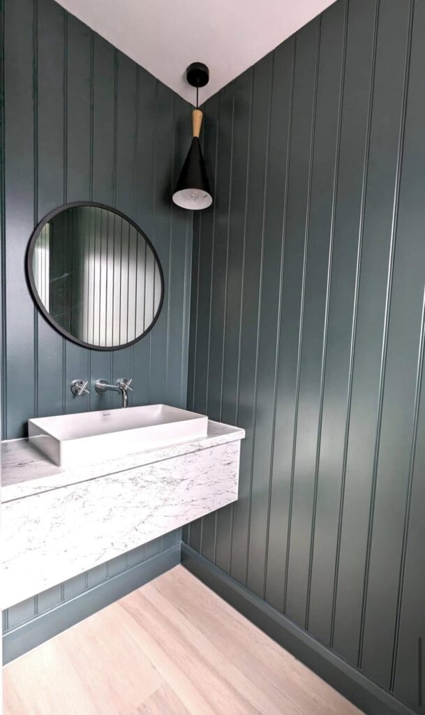
Grey has long been the dominant force in Scandinavian and industrial design. It is a powerful tool, providing a sophisticated, neutral backdrop for furniture, artwork, and textured accents. Professionals use grey to create spaces that feel classic, elegant, and visually soothing. However, there is a fine line between serenity and gloom. An over-reliance on grey, particularly in its darker and cooler tones under limited natural light (common in the UK climate), can inadvertently trigger feelings of melancholy. Our role as expert decorators is to advise clients on how to break this monotony—whether through high-quality plaster textures or the introduction of warm wood accents and soft textiles.
Blue: Mental Hygiene and Infinite Space
Blue is a “receding” colour, making it the perfect choice for optically enlarging smaller rooms. Physiologically, soft blues are proven to lower heart rates and facilitate a sense of calm before sleep. However, excessive use of cool-toned blues can lead to a sense of “sterility.” Given the British latitude and the scarcity of winter sun, we often suggest balancing blues with warmer under-tones to prevent a space from feeling uninvitingly cold.
Yellow: Energy and Intellectual Stimulation
The colour of sunshine, yellow, serves to “warm up” an interior. It stimulates the nervous system, improves memory, and aids concentration, which is why it excels in home offices and children’s study areas. Caution is advised regarding intensity, however; an overly bright yellow on every wall can lead to visual fatigue and irritability over time. We often suggest “mustard” or “ochre” for a more grounded, sophisticated energy.
Red: Pulse, Dynamics, and Appetite
Red has the longest wavelength and is the most attention-grabbing colour in the spectrum. It is known to raise blood pressure and stimulate the appetite, making it a classic choice for dining rooms. While interiors dominated by red are vibrant, they can make relaxation difficult. We generally recommend red as an accent—perhaps a single feature wall—to provide energy without overwhelming the subconscious.
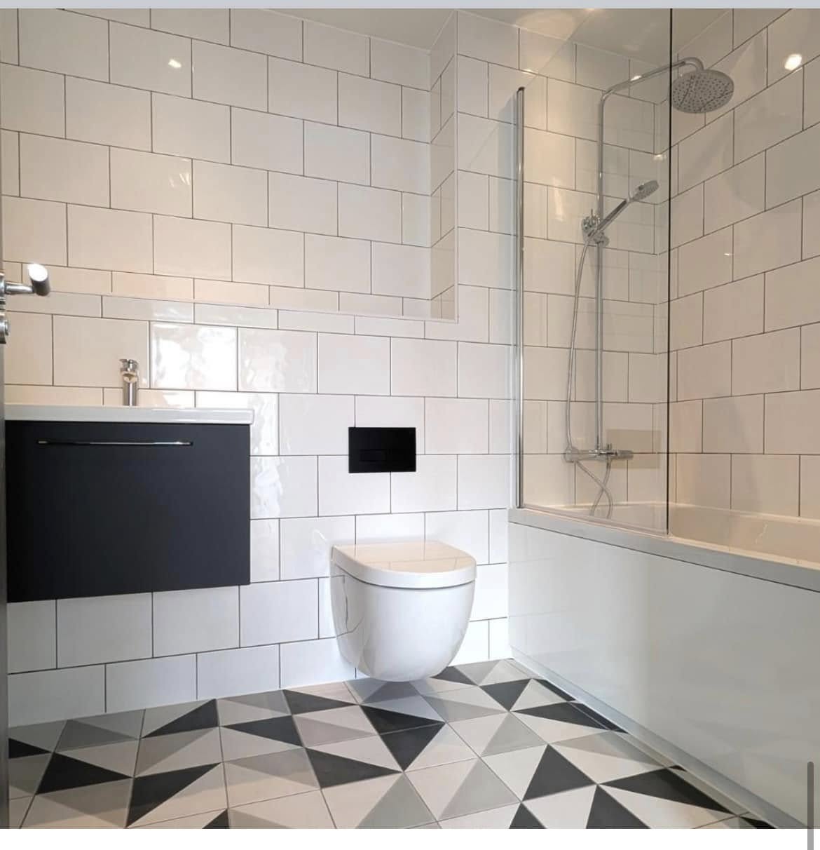
White and Beige: The Canvas of Balance
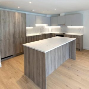
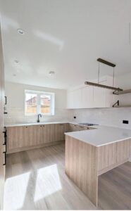
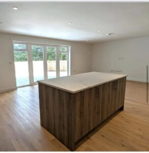
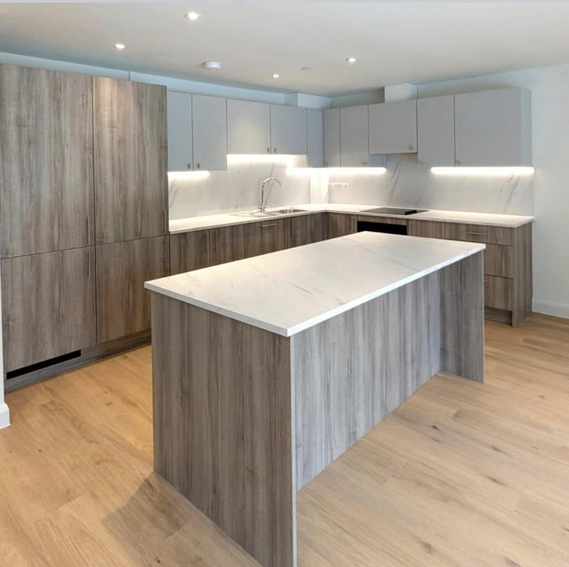
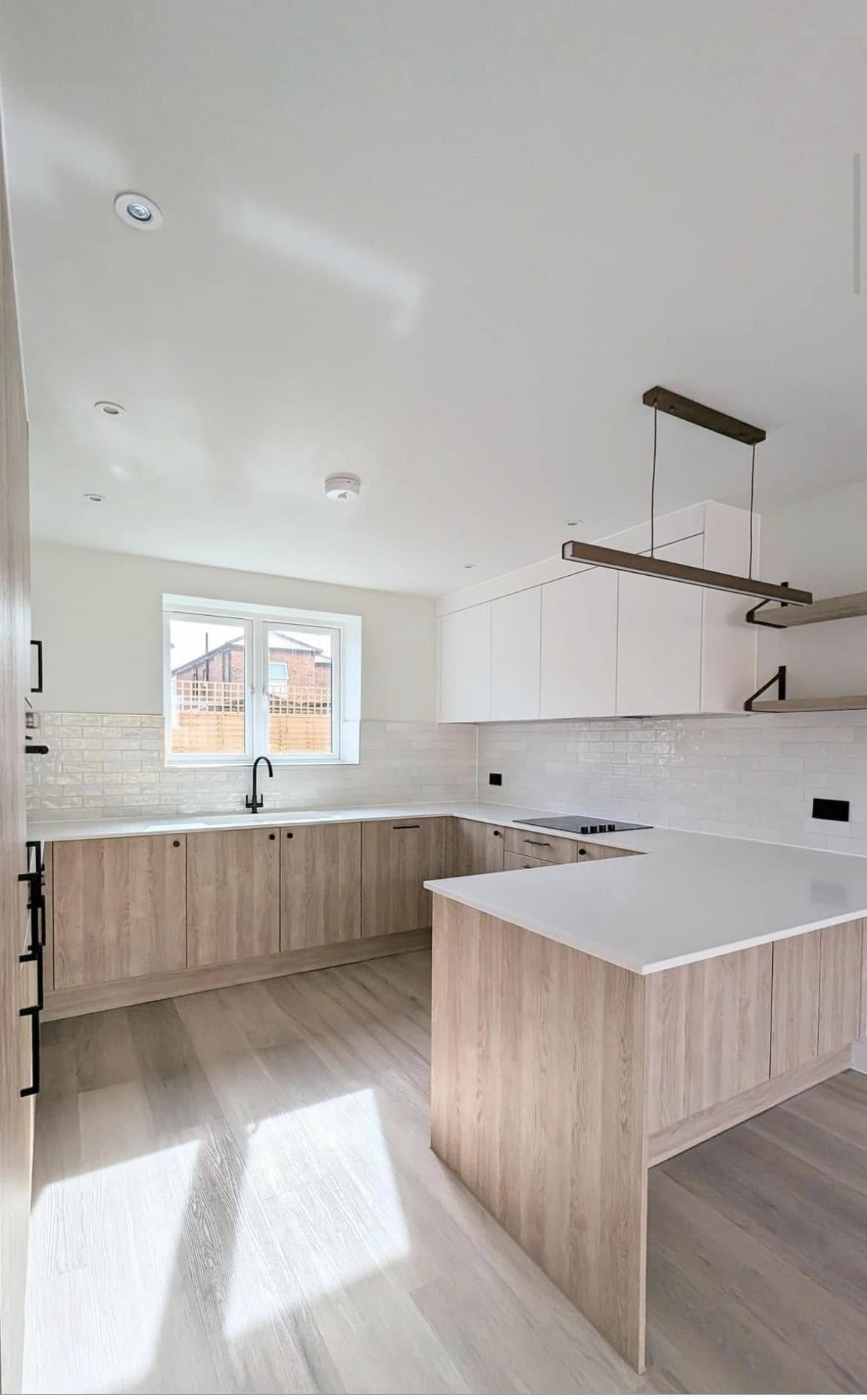
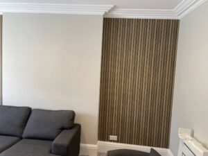
White remains a symbol of purity and endless possibility, allowing for any arrangement of accessories. However, a stark “hospital” white can feel harsh. Beiges, by contrast, introduce warmth and a homely atmosphere, remaining the safest and most timeless choice for those who value classic British elegance. When matching wall paint with wood flooring, these neutral canvases allow the natural grain of the timber to take centre stage.
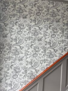
3. Unconventional and Bold Palettes – The Courage of Design
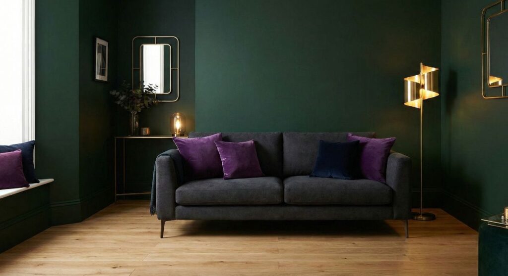
In the evolving landscape of British architecture, we are witnessing a significant shift away from “safe” neutrals. More homeowners are now seeking an interior colour consultation and decorating UK specialist to help them navigate the world of unconventional and controversial shades. We are talking about deep obsidians, moody anthracites, regal purples, and even daring neon accents. These choices represent a departure from the ordinary, moving towards what we call “design courage.”
The Rise of the Statement Interior
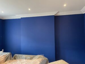
The primary advantage of opting for a non-standard palette is the ability to create a “statement interior.” Deep, saturated tones like navy blue or charcoal black provide an unparalleled sense of depth. Within the psychology of wall colours in home design, these dark shades are often associated with luxury, authority, and quiet sophistication. When executed correctly, they act as a dramatic stage for metallic details—gold, brass, or copper fixtures pop with extraordinary vibrant against a dark backdrop, creating an atmosphere of modern elegance that lighter colours simply cannot replicate.
Furthermore, dark walls can be surprisingly effective when matching wall paint with wood flooring. For instance, a deep forest green wall contrasted with a light oak floor creates a balanced, organic aesthetic that feels grounded yet high-end.
Technical Precision: The Professional Edge
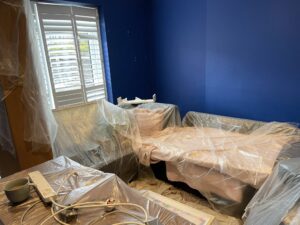
However, with great aesthetic reward comes significant technical responsibility. Darker and more vibrant pigments are notoriously unforgiving. Every minor imperfection in the plaster—scratches, uneven sanding, or “flashing”—will be magnified by deep colours. This is why a professional mist coat for new plaster walls is non-negotiable in these scenarios. Without a perfectly primed surface, the final finish will look patchy and unprofessional.
Lighting also plays a critical role. Without a strategic lighting plan, bold colours can “swallow” a room, making it feel claustrophobic rather than cosy. We always advise clients to consider the direction of natural light and the placement of artificial sources to ensure the colour breathes rather than stifles.
The Verdict: Quality and Finish
Our professional verdict is that these colours are for the conscious investor who isn’t afraid of a “moody” vibe. To achieve the best results, we always recommend using the best durable paint for kitchens and bathrooms UK markets offer, specifically opting for Class 1 scrub-resistant matte finishes. A high-quality matte finish is essential here; it absorbs light and prevents unsightly reflections that can make dark walls look “plasticky” or uneven. At Dartnall Decor, we believe that with the right preparation and a bit of bravery, unconventional colours can transform a standard house into a bespoke home.
4. Colour and Room Function – Why Purpose Matters
When undertaking an interior colour consultation and decorating UK project, one must remember that aesthetics should never override functionality. Each room in a British home serves a distinct biological and social purpose, and the palette must reflect this to ensure the well-being of its inhabitants.
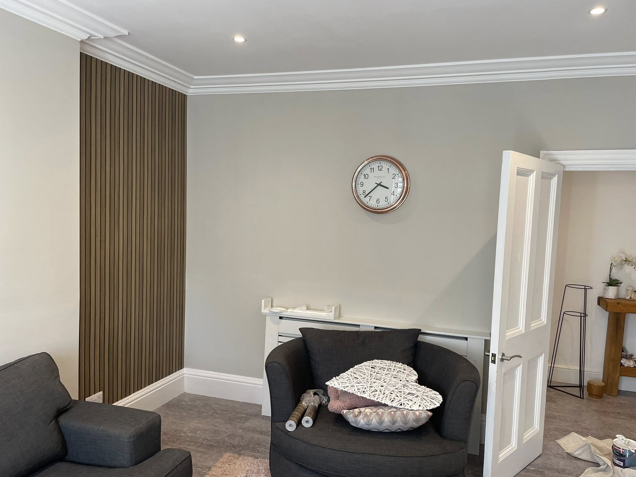
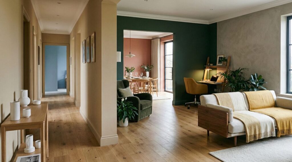
The Living Room: A Hub for Relaxation and Socialising
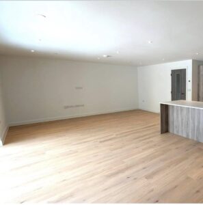
The living room is often the most versatile space in the home. Whether you are hosting guests or unwinding after a long day in the city, the choice of hue defines the experience. For those who use their lounge primarily in the evenings, we often suggest “cocooning” tones—deep anthracites, muted navies, or warm terracottas. These shades create a sense of intimacy and luxury. Conversely, if the room is a daytime social hub, light beiges and off-whites promote an open, airy, and welcoming atmosphere.
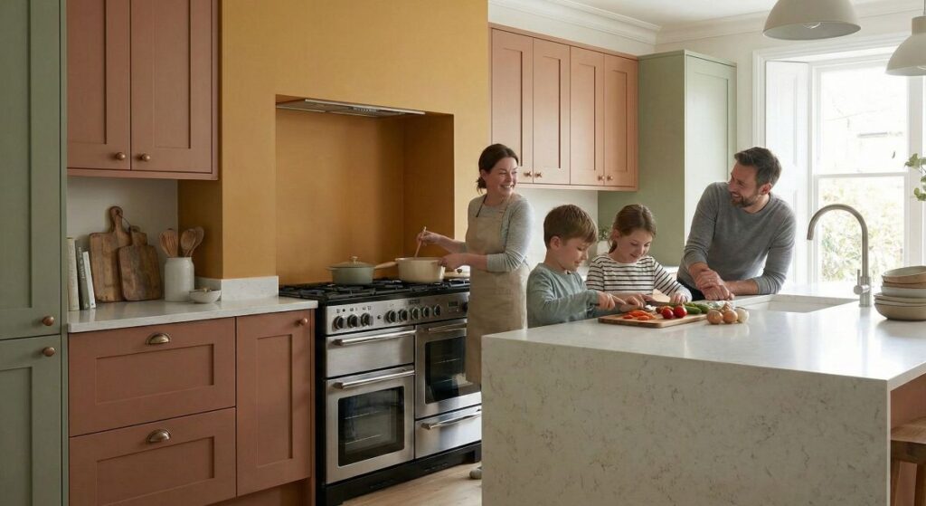
The Kitchen: Energy, Appetite, and Durability
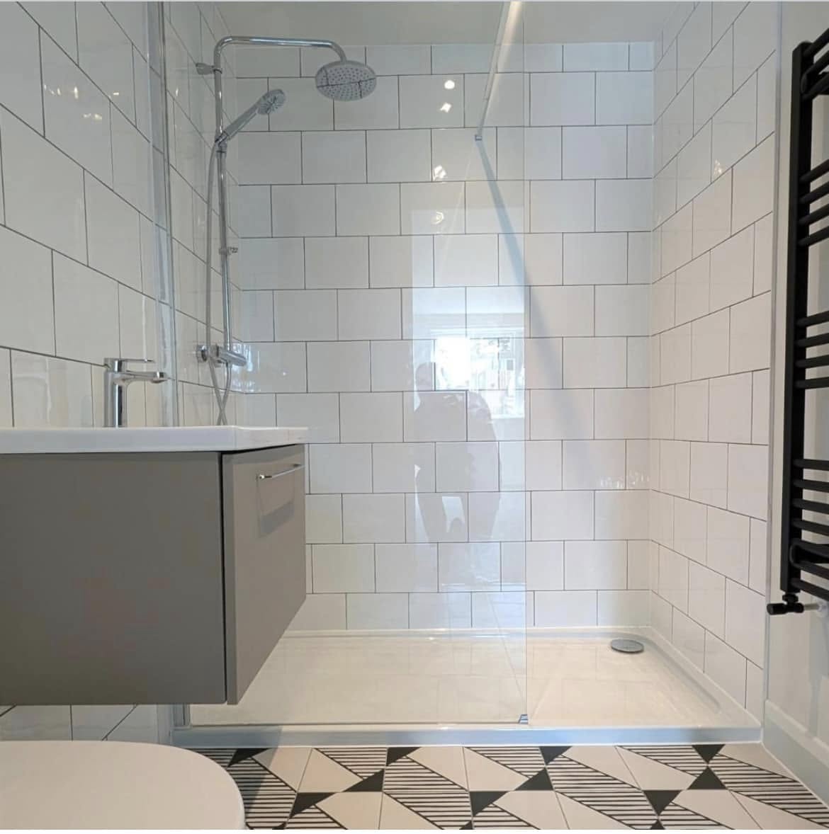
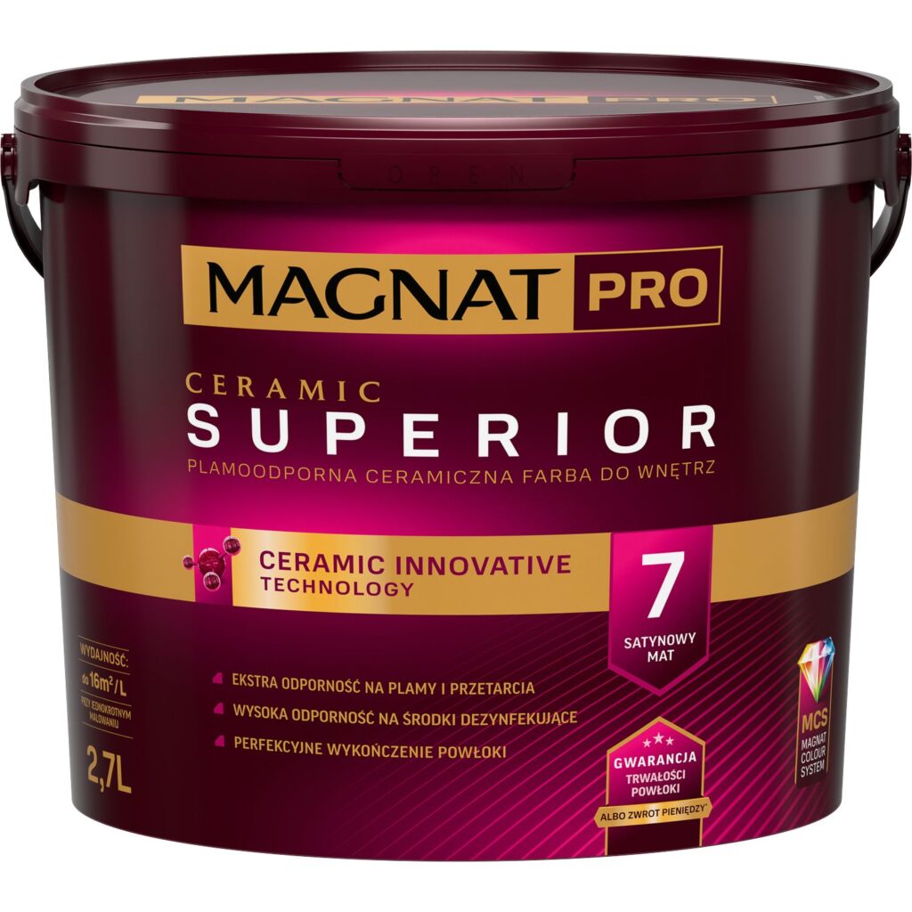
As the “heart of the home,” the kitchen requires a balance of psychological stimulation and technical performance. Warm tones like ochre, cinnamon, or sage green are excellent for stimulating the appetite and metabolism. However, because kitchens are high-traffic areas prone to steam and grease, choosing the best durable paint for kitchens and bathrooms UK markets offer is critical. We recommend Class 1 scrub-resistant ceramic or silicate paints that maintain their vibrant pigment even after frequent cleaning. While blue is popular, we generally advise against intense blues here, as they can subconsciously suppress appetite—a signal the brain often interprets as a warning in food-related environments.
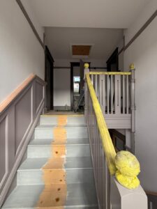
The Hallway: The Psychology of Transition
The hallway acts as a “pressure valve” between the outside world and your private sanctuary. Because British hallways are often narrow and lack natural light, we recommend soft dove greys or warm sands to eliminate claustrophobia. A professional decorator ensures that the hallway “previews” the rest of the house; a sudden jump from a warm beige corridor to a cold blue lounge can create a jarring subconscious dissonance for the residents.
The Bedroom: An Oasis of Regeneration
In the bedroom, the psychology of wall colours in home design is most vital. Here, aesthetics must yield to biology. To facilitate deep sleep and lower the heart rate, we recommend “cooling” shades like lavender, dusty pink, or deep emerald. These colours help the brain transition into a state of rest by masking distracting shadows. We strongly advise avoiding reds or bright oranges in sleeping quarters, as these high-energy pigments can lead to restlessness and hinder the body’s natural regeneration cycle.
5. The Foundation – Harmonising Walls with Flooring
In the world of professional interior finishing, we often describe the floor as the “second largest surface” in a room. Unlike a new coat of paint, quality flooring is a long-term investment that isn’t easily changed. Therefore, matching wall paint with wood flooring (or any other material) must be a deliberate decision that respects what is beneath your feet.
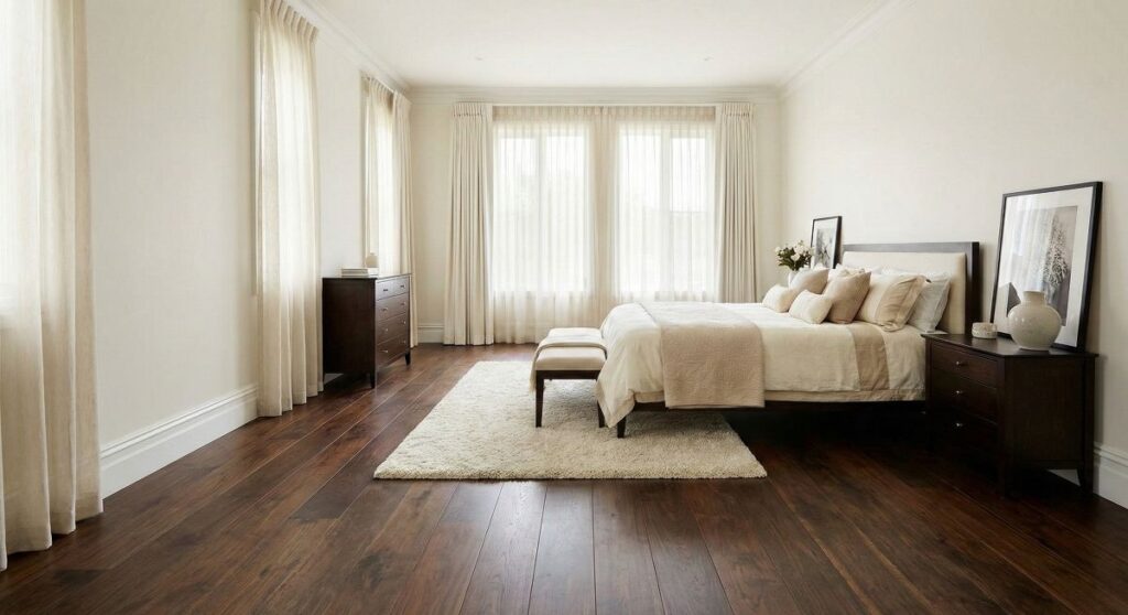
Dark Floors: Elegance Without the “Cave Effect”
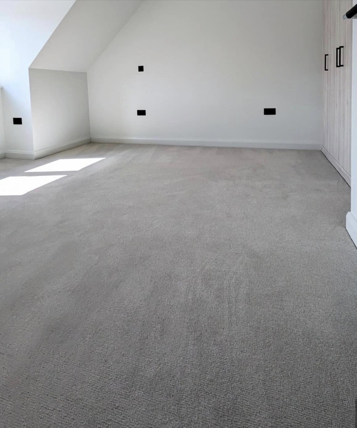
Dark floorboards, exotic timbers, or deep-pile carpets—frequently found in British bedrooms—add a sense of prestige and solidity. To avoid a claustrophobic “cave” feel, the psychology of wall colours in home design suggests using high-contrast shades. Opt for creamy whites, delicate beiges, or very light greys. This contrast allows the dark floor to act as a frame for the room, enhancing its luxury.
- Design Tip: If the room is small, paint your skirting boards the same colour as the walls (ideally a crisp white). This visually “lifts” the ceiling and prevents the dark floor from “closing in” the space.
Light Floors: Your Blank Canvas
Light oak, bleached ash, or modern light-grey laminates are staples of Scandinavian and contemporary British design. These floors are ideal for darker rooms with limited natural light—a common challenge in the UK. For a “Total Look,” combine light floors with off-white or pale grey walls to maximise the sense of space. Because light floors are so versatile, they provide the perfect base for an accent wall in a bold navy blue or bottle green without making the room feel small.
Warm Wood Tones: Natural Harmony
Classic oak, beech, or pine floors contain significant yellow, orange, or reddish pigments. To achieve harmony, we recommend “Earth Tones”—olive greens, sandy beiges, or warm ochres.
- The Grey Trap: Be cautious of cool, steely greys. When paired with warm wood, these greys can look “muddy” or lifeless, while the wood may appear unnaturally orange. As part of a professional interior colour consultation and decorating UK service, we always help clients find the right “greige” to bridge this gap.
Pro-Tips from the Painter’s Perspective
Achieving a professional finish requires more than just picking a shade; it requires technical foresight:
- The UK Light Factor: British light often has a “bluish” tint. Always apply a tester patch near the skirting board and observe it at different times of the day.
- Sheen Levels and Reflections: A satin or silk finish on the walls will reflect the floor’s colour more than a matte finish. If you have a vibrant mahogany floor, a matte paint will help “quieten” the reddish glow reflected onto the walls.
- Preparation is Key: Before applying these final colours, ensuring a professional mist coat for new plaster walls is essential for a uniform, long-lasting bond, especially when using the best durable paint for kitchens and bathrooms UK professionals trust.
6. Understanding Paint Types – Making the Right Technical Choice
When embarking on an interior colour consultation and decorating UK project, the choice of paint is about much more than just the shade. It is a decision based on physical and chemical properties that determine the coating’s longevity, the ease of cleaning, and the overall comfort of the living environment. To achieve a professional finish that lasts for years, one must understand the distinct categories of modern paint.
1. Emulsion Paints (Water-Borne)
Emulsions are the primary choice for contemporary British interiors. They use resins as binders and water as a solvent, making them environmentally friendly and safe for use in family homes.
Acrylic Emulsion:
This is a versatile, budget-friendly option based on acrylic resins. Its greatest advantage is high vapour permeability, allowing your walls to “breathe.” While easy to apply, it offers moderate resistance to mechanical damage. We typically recommend acrylics for ceilings, dressing rooms, or guest bedrooms where the risk of staining is minimal.
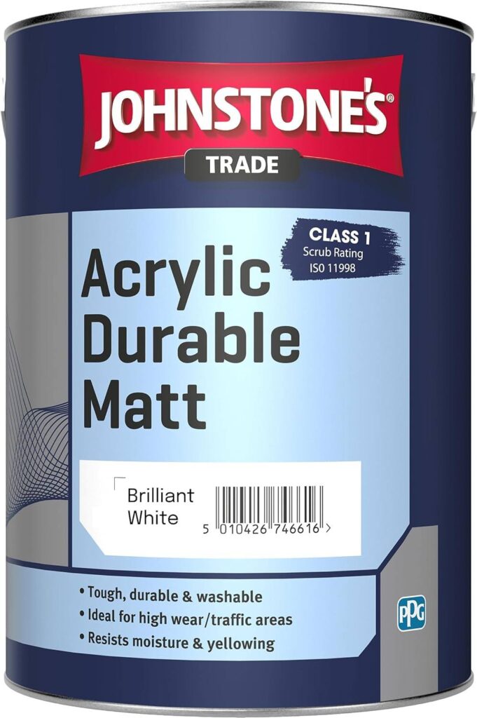
E.g. Johnstone’s Trade Acrylic Durable Matt
Latex Emulsion:
An upgraded version of acrylic paint with a significantly higher resin content. It provides excellent coverage and flexibility. Most premium latex paints reach Class 1 or 2 scrub resistance, making them ideal for high-traffic areas like lounges or children’s playrooms.
Ceramic Paints:
Representing the latest generation of interior finishes, these contain microscopic ceramic beads. They create an incredibly hard, smooth, and anti-static surface that does not attract dust. If you are searching for the best durable paint for kitchens and bathrooms UK professionals swear by, ceramic is the answer. It is highly resistant to intensive scrubbing and chemical detergents, ensuring that even the most stubborn stains can be removed without affecting the pigment.
2. Mineral and Specialist Paints
For specific architectural needs or damp-prone environments, mineral-based paints offer superior protection.
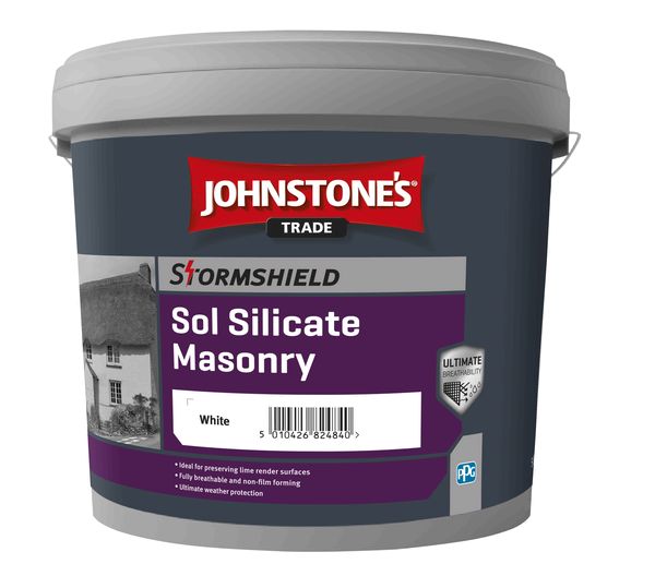
Silicate Paints:
These bond with the substrate through a chemical process called petrification. They are highly alkaline, providing a natural defence against mould and mildew—a vital feature for the British climate. They offer the highest level of vapour permeability.
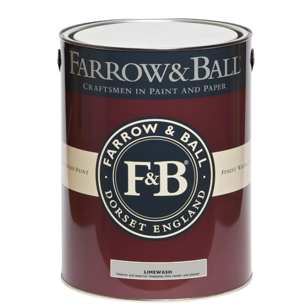
Limewash:
A traditional, eco-friendly solution making a comeback in sustainable design. It is naturally antibacterial and creates a unique, mottled aesthetic perfect for heritage properties.
E.g. Farrow&Ball Limewash
3. Functional and Special-Task Paints
Sometimes, standard solutions are not enough. We often incorporate functional paints into our designs to solve specific problems:
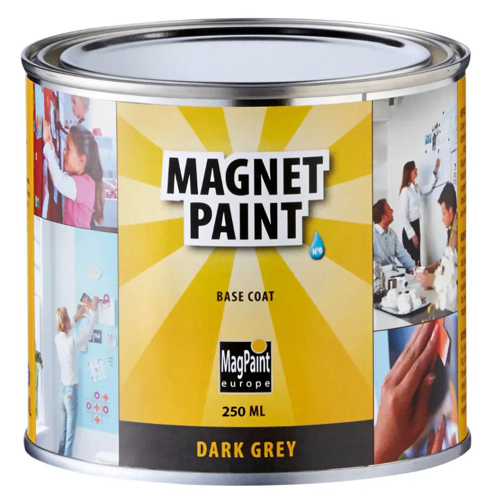
Blackboard and Magnetic Paints: Transform any wall into a creative space for children or an office noticeboard.
E.g. MagnetPaint
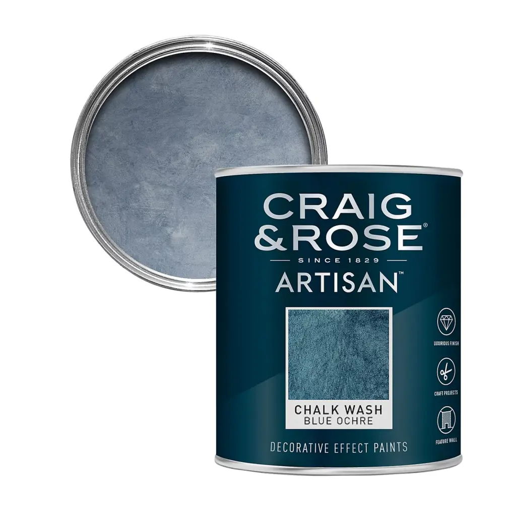
Structural Paints: Used to create 3D effects such as concrete, sand, or stucco textures—perfect for a feature wall when matching wall paint with wood flooring.
E.g. Craig and Rose Artisan Decorative Effect Paint
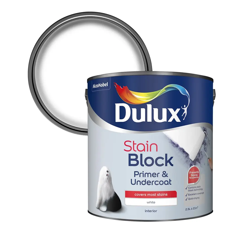
Stain-Blocking Paints: Essential for isolating difficult stains like soot, grease, or water marks before applying the final decorative layer.
4. Technical Parameters: Decoding the Label
A professional decorator looks beyond the brand name to the technical specs:
- Scrub Resistance Classes: Always aim for Class 1 for wet scrubbing. Class 2 is suitable for light washing, while Classes 3–5 are only resistant to dry wiping.
- Sheen Levels: A Dead Flat/Matte finish is excellent for hiding imperfections in the plaster, whereas Satin or Eggshell highlights architectural details and is significantly easier to clean.
- Coverage: Generally, a high-quality paint will cover 10–14 m²/l.
The Verdict: Professional Recommendations
For a flawless result, we suggest Ceramic for kitchens and hallways, Latex Matte for living areas, and Silicate for bathrooms to prevent moisture issues. Regardless of the product, always remember that a professional mist coat for new plaster walls is the foundation of any high-quality finish, ensuring the final paint bonds perfectly to the surface.
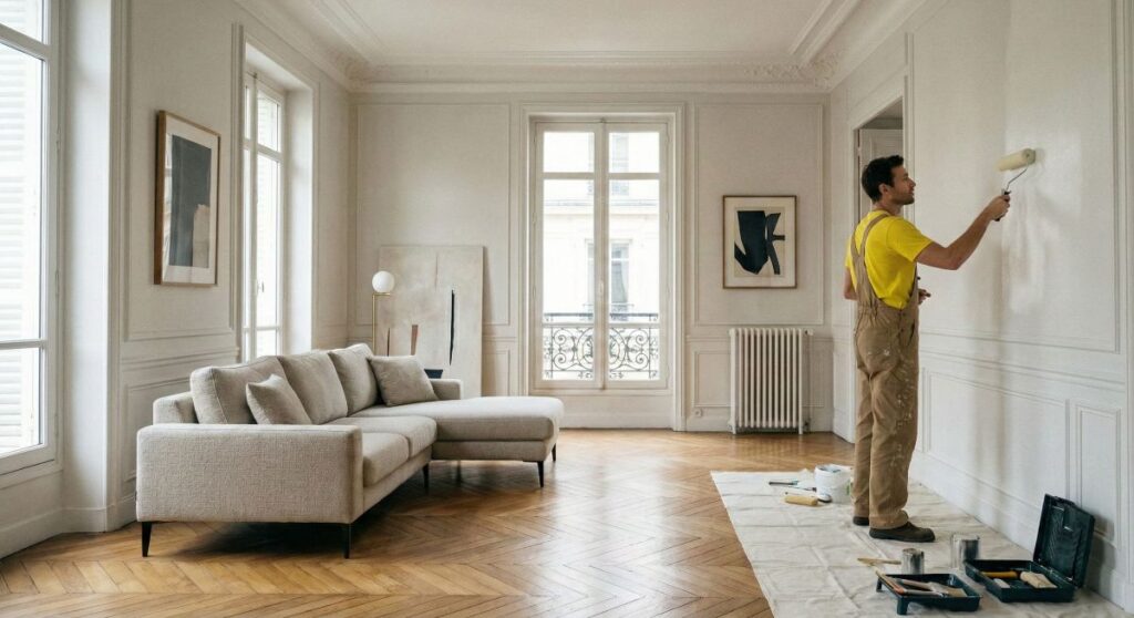
7. Painting Techniques and Drying Times – Professional Finishing Standards
Many homeowners assume that painting is the simplest stage of a renovation. In reality, it is this final process that determines the visual success and long-term durability of the entire investment. Even the highest quality pigments cannot hide technical errors or a rushed application. As specialists in interior colour consultation and decorating UK, we adhere to a strict set of professional standards to ensure a flawless, gallery-grade finish.
Surface Preparation: The Foundation of Quality
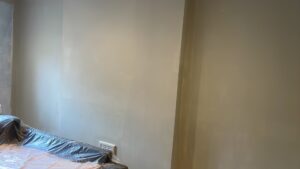
In professional decorative painting, we follow the “70/30 Rule”: 70% of the time is spent on preparation, and only 30% on the actual application. A correctly prepared wall is the only way to guarantee adhesion and depth of colour.
- Cleanliness Analysis: Surfaces must be entirely free of dust, cobwebs, and greasy residues. In high-traffic areas like kitchens or near light switches, degreasing the substrate is a mandatory step.
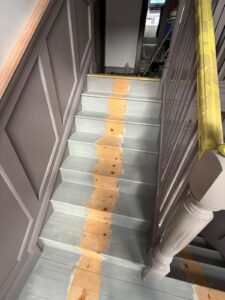
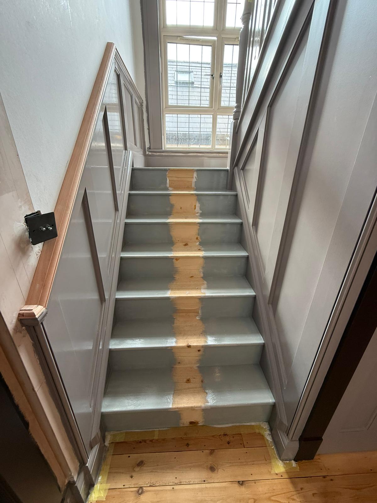
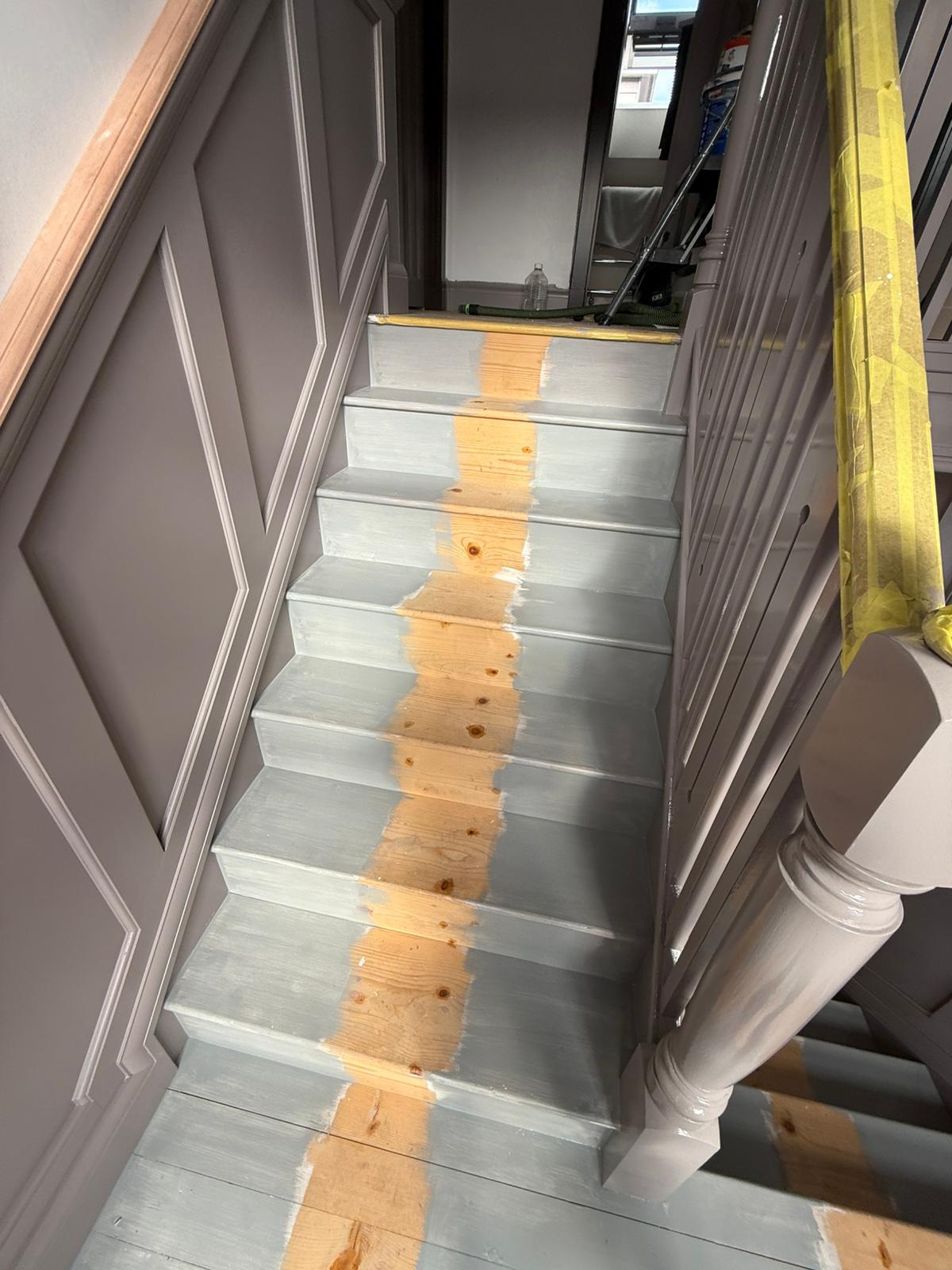
- The Professional Mist Coat for New Plaster Walls: This is a critical phase, especially for new builds or extensions. New plaster is incredibly thirsty; if you apply undiluted premium paint directly, it will dry too fast and peel. We apply a “mist coat”—a specifically diluted emulsion that penetrates deep into the plaster, creating a perfect “bridge” for subsequent layers. This ensures that your best durable paint for kitchens and bathrooms UK investment doesn’t go to waste.
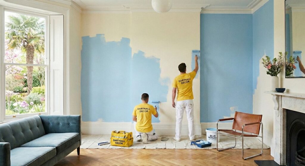
The “Wet on Wet” Technique
The greatest challenge in DIY painting is the appearance of streaks and visible joins. The key to success is maintaining the right tempo and the “Wet on Wet” technique.
- Section Planning: We paint in vertical strips approximately one metre wide, always working from the top down.
- Continuity: Each new strip must overlap the previous one while the paint is still wet. This allows the pigments and binders to fuse seamlessly, eliminating the risk of “flashing”—those unsightly shiny patches where the paint has doubled up.
- Discipline: One must never “touch up” an area that has already begun to dry. Attempting to fix a small spot after just a few minutes can tear the forming film of the paint, permanently damaging the texture.
Tool Selection and Surface Texture
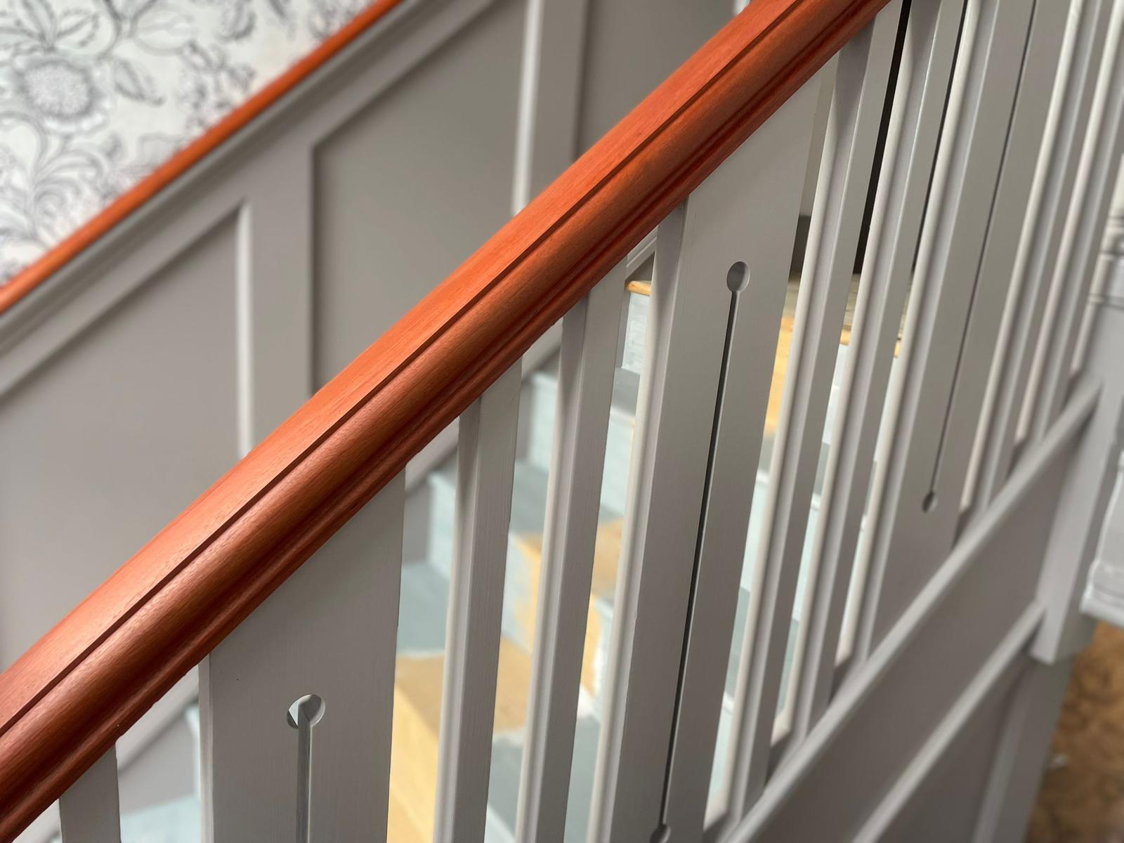
At Dartnall Decor, we select our tools based on the specific substrate and the desired aesthetic, which is just as important as matching wall paint with wood flooring. The “pile” (fibre length) of the roller determines the final look:
- Short Pile: Essential for perfectly smooth plaster, resulting in a glass-like finish with minimal texture.
- Medium Pile: The most versatile choice for standard British plasters and wallpapers.
- Long Pile: Necessary for rugged surfaces like brickwork or uneven masonry to ensure the paint reaches every crevice.
The Curing Schedule: Drying vs. Hardening
Understanding the chemistry of drying prevents the most common post-service issues. There are three distinct phases:
- Touch Dry (2-4 hours): The surface feels dry, but the film is still delicate and prone to deformation.
- Re-coat Window (4-6 hours): The second coat must be applied according to the manufacturer’s strict timeline to avoid trapping moisture, which leads to bubbling.
- Full Mechanical Cure (21-28 days): This is the most vital parameter. Most high-performance paints, especially the best durable paint for kitchens and bathrooms UK, only reach their full scrub resistance after nearly a month. During this period, we advise clients to be exceptionally careful with the new surfaces.
By following these rigorous procedures, we ensure that our decorating services provide not just beauty, but a lasting investment in your home’s interior.
8. When to Paint? – Our Year-Round Strategy at Dartnall Decor
A common misconception among homeowners is that interior decorating is a seasonal service reserved only for the warmer months. At Dartnall Decor, we operate throughout the year, utilizing our extensive experience and advanced equipment to achieve flawless results regardless of the weather outside. Every season in the UK presents its own unique environmental characteristics, and our professional approach allows us to leverage these conditions to the benefit of your project.
Spring and Summer: The Gold Standard
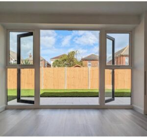
Traditionally, spring and summer are the most popular times for renovations. The reasons are clear: the abundance of natural light during the long British days allows for an impeccable inspection of surfaces, ensuring that every brushstroke is perfect.
- The Environment: Optimal temperatures (between 15°C and 25°C) and lower humidity levels significantly accelerate the drying and curing process.
- Ventilation: The ability to keep windows open allows for rapid air exchange, which is crucial for removing any “fresh paint” scent quickly—an essential factor for households with children, pets, or allergy sufferers. During a summer interior colour consultation and decorating UK session, we often plan projects to take advantage of this natural speed.
Autumn: Balance and Stability
The transition into autumn is a highly underrated period for painting. When the extreme heat of mid-summer fades, the air becomes more stable, which is actually beneficial for the “Wet on Wet” technique described in earlier sections.
- Drying Control: Because the paint does not dry too rapidly on the roller, it is easier to maintain a “wet edge,” eliminating the risk of flashing.
- Moisture Management: As humidity begins to rise in the UK, we monitor the air levels closely. If the moisture content exceeds 70%, we deploy professional dehumidifiers to ensure the coating releases its water content correctly, maintaining the integrity of the finish.
Winter: Professional Interior Refresh without Compromise
Contrary to popular belief, winter is an excellent time for interior updates, provided your decorator possesses the right technical knowledge. Modern paint chemistry and climate control technology mean that “winter painting” is no longer a risk.
- Thermal Management: The secret lies in maintaining a consistent internal temperature (not lower than 10-12°C). We advise keeping the heating on a steady, moderate setting, ensuring that radiators near freshly painted walls are not on maximum, which could cause the coating to crack.
- Smart Ventilation: Instead of leaving windows slightly ajar, which chills the masonry, we use “flash-ventilation”—short, intense bursts of cross-draught that swap humid air for dry air without dropping the wall temperature.
- Advanced Chemistry: In winter, we often select high-performance products with faster binding times. This is also a peak season for new-build completions, where a professional mist coat for new plaster walls is essential to handle the internal moisture of a new structure while applying the best durable paint for kitchens and bathrooms UK standards require.
The Verdict: Flawless Results All Year Round
Whether you are planning a renovation in a sun-drenched July or a misty November, the Dartnall Decor methodology guarantees that your walls will look impeccable for years to come. Our year-round strategy ensures that matching wall paint with wood flooring and achieving the perfect aesthetic is never dictated by the calendar, but by professional precision.
Planning a renovation? Unsure which paint is right for your space? Contact us today – we provide expert advice, detailed valuations, and a professional refresh for your home’s interior!